Debates about nuclear energy rarely address an issue critical for future generations: how to warn them away from buried nuclear waste. The problem: In 10,000 years, society and language would have gone through profound changes. What words or symbols would still be understandable that far in the future?
In a recent paper published this summer in Critical Inquiry, Andrew Moisey, assistant professor of history of art and the Frederick M. Rosevear ’64 and Joyce A. Yelencsics Rosevear ’65 Faculty Fellow, offers a critical analysis of one attempt to resolve the problem.
As Moisey relates, the U.S. Department of Energy (DOE) decided in 1989 that a warning system, “immune to historical change,” should be placed above the world’s first underground nuclear waste repository buried in an abandoned salt mine in New Mexico. The DOE assigned two teams of geologists, anthropologists, materials scientists, cognitive scientists, linguists, architects, archaeologists, astronomers and artists to design deterrents.
In his paper, Moisey analyzes where each of the DOE teams went wrong.
Team B thought future inhabitants of the U.S. would still have the faculty of reason and would recognize bureaucratic rhetoric. Basing their design on the stick-figure sequences used in U.S. National Parks, they designed a pictogram that told the story of the waste repository’s creation, conveying how much time had passed and the dangers of what lay beneath the surface.
The problem, writes Moisey, is “Team B did not realize just how much shared cultural background is needed to make a speech act successful and thus how oversimplified their pictographic warnings were.” The pictogram could easily be read as a map to buried treasure, according to Moisey.
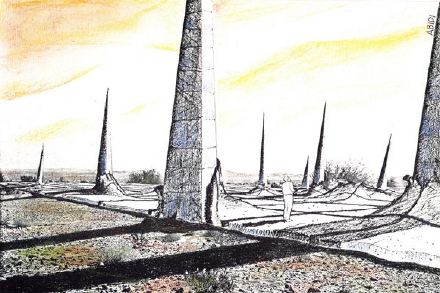
Team A design. Concept by Michael Brill, art by Safdar Abidi.
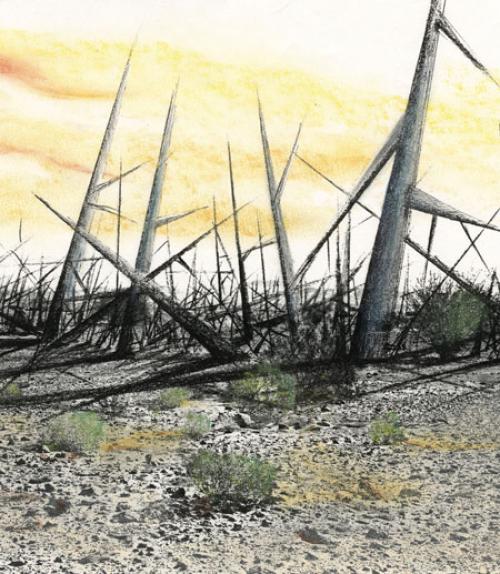
Team A’s approach was to use affect – emotion – to warn people away from the nuclear waste. They wanted their design to be both awesome enough that it would be preserved, while awful enough that people would instinctively want to stay away.
Their problem, according to Moisey, is that their designs were too alluring. They were what lawyers call “attractive nuisances,” curious objects in the middle of a desert that would likely prove irresistible to casual passersby.
“Any marker, no matter what it looks like, will attract future humans to it,” writes Moisey. “Once the civilization that shines meaning upon it sets over the horizon, it will be shrouded in darkness forever. Such is the fate of all unidentified objects that come in contact with a boundless historical imagination.”
Moisey concludes his paper by noting a possible explanation for why Team A’s designs were so alluring. “Perhaps they could not resist the opportunity it offered for a kind of immortality,” he writes. “This would be an understandable response from a group asked to devise the final communication of the first truly Promethean civilization.”
And perhaps that is also why the DOE’s latest marker plan uses a version of Team A’s design.
This article also appeared in the Cornell Chronicle.


